1. Understanding GIS
A quick note about the practicals...
Remember that coding should be done in Spyder using the understandinggis virtual environment. If you want to install the environment on your own computer, you can do so using the instructions here.
You do not have to run every bit of code in this document. Read through it, and have a go where you feel it would help your understanding. If I explicitly want you to do something, I will write an instruction that looks like this:
This is an instruction.
Remember that we are no longer using Git CMD. You should now use GitHub Desktop for version control.
Don't forget to set your Working Directory to the current week in Spyder!
Shortcuts: Part 1 Part 2
In which we are introduced to Python and Spyder, and make our first programmatic map with Python.
Part 1.
Note: If you are working on your own machine, you will need to install the understandinggis Python environment before completing this practical. The instructions for this can be found here. However, this takes some time, so please do not use your class time to do this. Use a lab machine for now, and then you can install the environment after class.
Introducing Python
![]()
Python is a programming language that is named after the classic British comedy troupe Monty Python. It is what we would describe as a high level programming language, which means that it is typically less complicated and a bit more user friendly than more lower level languages such as C, C++ or Java. The general rule is that high level languages make it quicker and easier to write code, but often at the expense of those programs being slightly slower when they execute.
The exciting thing about Python is that it can link up with lower-level languages such as C or C++ through the use of libraries, which means that you can get the best of both worlds: code that is simple and efficient to write, but which runs quickly too! We will be using several such libraries throughout this course, which will handle complex or mundane tasks for us such as reading and writing GIS data files, rendering maps and transforming coordinates, for example. Thanks to these Python libraries, we can do all of these things and more with only a few lines of code, allowing us to ignore the basic functionality and focus on computational techniques and algorithms.
Here is an overview of the main libraries that we will be using:
| Library | Purpose |
|---|---|
geopandas |
Read, write and edit vector GIS files |
pyplot |
Draw maps (normally via geopandas) |
pyproj |
Handle map projections (normally via geopandas and rasterio) |
shapely |
Handle geometry, topological relationships / operations and use spatial indexes (sometimes via geopandas ) |
rasterio |
Read and Write Raster data |
networkx |
Undertake network analysis |
math & numpy |
Various mathematical functions and random number generators |
Don’t panic if anything in that table doesn’t make sense to you yet, it will do soon! Each library will be introduced to you at the time you start to use it, so there is no need to memorise this list, it is just a good illustration of the sort of tools that we have available to us in this course.
Crucially, one thing that we will not be using libraries for in this course is to undertake the cartographic and analytical algorithms that we study. We will be writing these for ourselves, in order to gain a deeper understanding of how GIS really works.
Let’s have a go:
Introducing Anaconda

One of the interesting things about Python is that users typically keep several copies of Python on their machine, which are called virtual environments. We do this because Python has so many libraries that you can use, installing them all in one place can quickly become unwieldy.
Most programmers will therefore have a different virtual environment for each project, which will contain:
- A specific Python Interpreter - this is the software that converts your Python Code to Byte Code, which will be run inside the Python Virtual Machine. In our case, this should be the
Python 3.10interpreter. - A set of Python libraries that you will use - these add functionality to the ‘core’ language. In our case, we will mostly use libraries that provide GIS functionality.
A programmer can then switch between virtual environments as they switch between projects, allowing them keep everything neat and tidy, and avoiding any conflicts between different versions of Python, different versions of libraries, and so on.
This is what Anaconda is for - it is a manager for virtual environments, which helps you to easily switch between different virtual environments and helps you to easily find and download libraries that you want to add. Note that Anaconda is not part of Python (you can do all of these things perfectly well without Anaconda), but is simply a tool to help make life easier for Python developers. You will not interact much with Anaconda during the course (as the understandinggis virtual environment has already been set up for you), but it is well worth knowing that it is there!
Introducing Git and GitHub

Please note - we will now be using GitHub Desktop to complete the practicals!
Git and Github are critical tools for any programmer. Git is an Open Source and very widely used version control system that is used to keep track of all of the work that you have done on a particular coding project, which allows you (for example) to have multiple versions of your code at the same time or to revert your code back to a previous point in history. Git stores all of your code, history and everything else in a Git Repository, which on your computer looks just like a regular directory.
GitHub is a website owned by Microsoft that provides functionality to store online Git Repositories, which you can use to sync projects across multiple machines, collaborate with other programmers, keep a backup of your code and history, release Open Source code to the community, and lots of other things too!
Note that Git and GitHub are two separate things - though you can’t use GitHub without Git, you can happily use Git without GitHub! In this course, we will be using software called GitHub Desktop to hadle all of our Git operations.
In this course, we will maintain a Git Repository for all of our code, which we will push (sync) to GitHub - the use of Git and GitHub are an important part of our learning, and (critically) an important part of how you are assessed. You will need to submit your assessment code as a GitHub repository (with complete history), and inadequate version control will severely limit the number of marks that you are able to attain. Please make the effort to get used to it early!!
Make sure that you have set up and activated an account on GitHub with the username
gis-[student number], for example, if you had student number123456789, then your user account would begis-123456789. Please do this even if you already have another GitHub account - but only do it once for this course!.
Once you have your GitHub account sorted, you can get set up to begin the course:
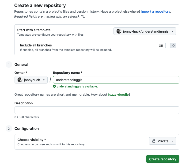
Go to this GitHub repository to get the template for the course. Click on the green Use this template button in the top tight and select the option for Create a new repository. Name the repository
understandinggis, set visibility to Private and click the green Create Repository button:
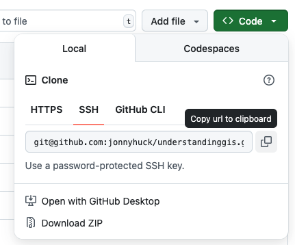
When the process is finished, click on the Green <> Code button and select the SSH tab, then click the button to the right of the grey box (containing text beginning
git@github...) to copy the contents to your clipboard (if you have any issues with this, you can just highlight the URL and copy it in the normal manner)
Have a look in your P Drive folder (just double click on the icon on your Desktop) and see if you have a Directory called
UGISthere already. If you do, open it and make sure it is empty. If not, create one in Windows Explorer (or Mac Finder) just as you normally would.Open GitHub Desktop and make sure you are logged in (using your GitHub account)
Select your
understandinggisdirectory in the list on the left and click the blue clone button at the bottom


In the box that pops up, use the Choose button to navigate to your
UGISdirectory, this is where it will store the local version of yourunderstandinggisrepository

It will take a few seconds to do the clone and you are then ready to go. There is just one more step…
In Spyder, open and run the
download_data.pyscript (watch the outputs to monitor progress, as it will take a little while) - this will install the necessary datasets for the course in yourUGISdirectory.You are now set up and ready to go! If you keep the Changes tab open, then any edits you make in your repository will appear in the list.
Introducing Spyder
![]()
There are numerous programs that you an use to write software in Python - and frankly any old text editor will do. However, some are better for the purpose than others, and have extra functionality built in to make life a bit easier for programmers - we call these IDEs (Integrated Development Environments).
We will be using an IDE called Spyder, which is designed for use by data scientists (as opposed to software developers), but nevertheless provides lots of useful functionality to help make life easier for us during the course!
To open Spyder, you can:
- Open Anaconda Navigator from your Applications Directory, set the Applications on dropdown box to
understandinggis. Then press the Launch button for Spyder. - You can open Anaconda Prompt (Windows) or Terminal (Mac) and, run
conda activate understandinggisfollowed byspyder. - On a Windows machine, you can also open Spyder by pressing the Windows button (either at bottom left of the screen, or on your keyboard) and selecting Anaconda3 → Spyder (understandinggis).
Open Spyder
Note: however you do it, make sure that you have selected the understandinggis version of Spyder!
When Spyder opens, it might ask some questions including:
- Would you like to update Spyder? (un-check the box for “Check for Updates at Startup” and press OK)
- Would you like to Start a Tour (click Dismiss)
- Anything else - just accept the defaults and dismiss.
It should then look something like this:
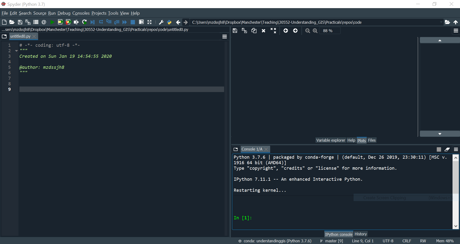
As you can see, the screen is split into three sections: You have code in the panel on the left, the console in the panel on the bottom right, and an extra panel on the top right where we can draw our maps (which we’ll call plots) - you will need to select the plots tab if it is not selected automatically.
Note that on the first use you might get a message in the console pane saying something like Matplotlib is building the font cache, this may take a minute. Give it a few minutes then click the x where it says Console 1/A. All being well, the job will have completed and you will have no problems (which looks roughly like the screenshot above).
If the warning stays there for more than a few minutes, you might have a problem caused by an error made by IT during installation, you can see how to fix it here, or simply put up your hand and one of the staff will come and sort it for you.
Please remember that, as with Anaconda Spyder is not an essential part of Python - in fact, I don’t particularly like it! You could equally write Python in Notepad, Notepad++, Idle, PyCharm, VS Code, Netbeans, or one of many other IDE’s. One advantage of Spyder is that it has lots of useful features for Python developers, such as the run button (to execute your code), the plots pane (so you can see what your maps look like automatically), and so on. Nevertheless, it is important to understand that Python is the language, and Spyder (like Anaconda and Git) is simply one of many tools designed to help you write it! This is important because, for example, if you don’t like Spyder, this doesn’t mean that you don’t like Python - you can just switch to a different editor!
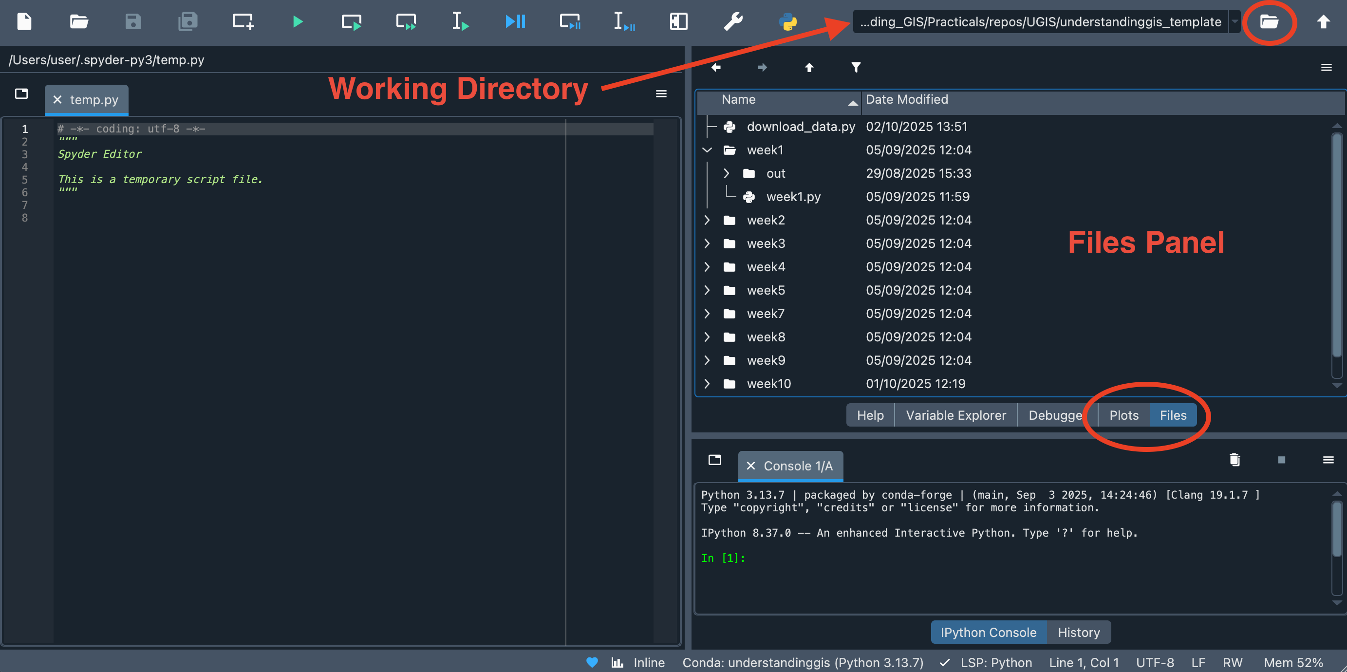
Setting the Working Directory
Just like GitCMD, you need to point Spyder at the correct directory to make it work properly.
In the Tabs on the right hand side of the screen, switch it from Plots to Files.
Now, you need to set the Working Directory for Spyder to your
understandinggisdirectory. Either navigate to it using the browse ()button in the top right hand corner of the screen, or navigate to it in the Files Pane (top right) and then double click on it. In either case, the path to your
understandinggisdirectory should be visible in the Working Directory box on the top right of the screen:
Downloading the Course Data
Now we have almost everything in place, we just need to download the data for the course.
If you have a file called download_data.py in your understandinggis directory, do this, otherwise, skip to the next bit:
In the files panel, double click on
download_data.pyto open it in the code panelClick the Run button (
) and watch the outputs in the console panel - be patient as it takes a while, but this shoudl download all of the data you need for the course and put it in the correct place
In Explorer (or Finder if on a Mac), check that you now have a folder called
datainunderstandinggis
If you did not have download_data.py in your understandinggis directory, or the above didn’t work for any reason, do this instead::
Download the data manually by clicking on the link here. This will give you a Zip File called
data.zip, which means it contains compressed data.Create a directory (folder) in
UGIScalleddata(this should be next to, not inside, yourunderstandinggisdirectory)Right click on
data.zipand select Extract All and press OK.Once this is done, you should have a new directory that contains a number of folders (called
bolton,natural-earthetc.). Drag all of them into theUGIS/datadirectory that you created.
Whichever way you did it, your file structure should now look something like this:
- UGIS/
  - data/
  	- bolton
  	- etc...
  - understandinggis/
    - week1/
      - week1.py
      - out/
    - week2/
    - etc...
Check that your file structure matches the above
If so then great - you are ready to get coding!
Having a go at some Python
The above is all well and good, but it doesn’t really teach you much. To learn how to write some Python for ourselves, we need to go back a few steps
In Spyder, open
week1/week1.pyand add the below snippet:
print("hello world!")
Now press Ctrl+S to save the file then press the Run button (or press F5):
Your code should run and the console will respond:

Can you see what happened there? You just ran your first program - you gave the computer a command (to print the phrase hello world) and it did it!
Printing Hello World is the traditional first thing that any programmer does with a new language - and now you are part of this great tradition!
What do you think will happen if you change it to
print(2+2)and run it again? Try it, were you right?
Having a go at some Git
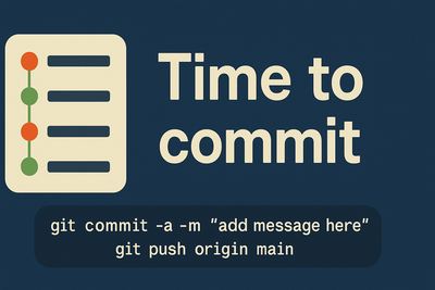
Now that we have written some code, we should commit it to your version control system. This might seem a little tedious when you are first starting out, but it is a vital part of the coding process and is tremendously helpful!
Go to GitHub Desktop, and make sure that it recognises that
week1/week1.pyhas been modified, and needs to be committed. Follow the below steps to commit your changes (register them in the version control) and then push (sync) them to the remote repository on GitHub:
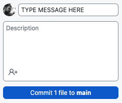
- Add a short message to the Summary box stating that you have
added world dataset as a GeoDataFrame, ignore the Description box and click the blue Commit to main button to commit your changes.
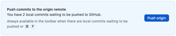
- Either click the blue Push origin button that appears in the panel on the right (which will only be there just after you commit), or the Push origin button in the black bar at the top (which is always there).
 OR
OR 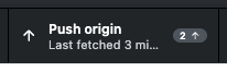
Now, go to your remote repository on the GitHub website and navigate to the
week1/week1.pyfile - you should now be able to see your changes synced online:
Make sure that you can see
"print(hello world!")in your repository on GitHub
Congratulations - you have successfully done some version crontrol with Git!
Stop here, time to go back to the lecture!
Part 2.
Python Fundamentals
Now we’re up and running, let’s briefly recap you to a few simple programming concepts from the lecture:
Comments
When programming, it can quickly become hard to remember what each part of your code does, which can cause difficulties further down the line. To get around this, programmers use comments, which are lines of code that get ignored by the Python interpreter, and so serve no purpose other than to make the code more readable.
To add a comment, simply insert the # symbol. Everything after it will be ignored:
# This doesn't do anything...
print("Hello World!")	# ...neither does this!
print(2+2)
Try adding some descriptive comments to your program in Spyder and re-running it. Does it still work?
For the purposes of this course, comments are particularly important, as they are used to help me mark your work! Here is a useful rule of thumb for writing good quality code:
A good rough guide for well-presented code is that you should have roughly:
- one-third code
- one-third white space
- one third comments.
This is called the Rule of Thirds - remember it (particularly around assessment time…)!
Variables
One of the most important things to know about in Python (or any other programming language) is the variable. Variables are containers in which you can store values, and then retrieve them later. Python creates variables for you as you need them, so all that you need to do to create one is type its name and then use an = sign to assign a value to it. Here is an example:
# assign values to some variables
value_1 = 2
value_2 = 4

# use those variables to calculate a value for another variable
value_3 = value_1 + value_2

# print out the value of that variable
print(value_3)
Paste the above into
week1.pyin Spyder, save it and run it. What does the above print out? Is it what you expected?
In Python, variable names can’t have any spaces or characters that are not a-z, A-Z, 0-9 or _ in them, and they cannot start with a number. By convention, variables in Python are normally written in snake_case (as opposed to UPPER CASE, lower case or camelCase), which is where all words are in lower case, and separated by underscores (_). All of these are valid variable names in snake case:
snake_casea_really_long_variable_nameshortimy_variable
Each variable will have a particular type, which specifies what kind of a value it can hold. Whilst you do not have to specify the type yourself (because Python works it out for you), it is important that you understand what the different types are, as not understanding this will lead to errors later on. Fortunately, it’s pretty simple:
| Variable | Explanation | Example |
|---|---|---|
| String | Some text. To signify that the variable is a string, you should enclose it in either single ('...') or double ("...") quote marks. |
my_var = "Bob" |
| Integer | A ‘round’ number with no decimal places. Numbers don’t have quotes around them. | my_var= 10 |
| Float | A number with decimal places. Numbers don’t have quotes around them. | my_var= 10.5 |
| Boolean | True or False (with no quotes) |
my_var= True |
Create your own variable (using any name you like, but using snake case, of course) add a value to it, and then print out the variable using the
print()function (check the snippet above to see how it is done!)
In a compiled programming language, we would have to specify which type of value a variable will hold at the time it is created. In Python, however (an interpreted programming language), we can let it work that out for us! This is called dynamic typing, and is one of the many features that makes Python so easy to read and write.
A word about Objects, Properties and Functions
We will get to objects, properties and functions in greater detail later on in the course, but for the next bit, it would be good for you to have a general understanding of what an object is. Simply, variables that do not contain to the above 4 types will likely contain an object.
In programming, we often create objects to represent things that exist in the world. Objects could be Map, Rock, Lake, Person, CoordinateReferenceSystem, absolutely anything that your program needs to understand. Objects might have properties (code that stores information about them) and Functions (code that does something, or works something out). We will learn about these in greater detail later, but for now, here is a quick example:
Imagine that we were making a programmatic woodland. Objects that we created would probably include:
Woodlandto represent the woodland itself. This might have a property callednumber_of_trees, and a function calledget_trees(), which returns a list of all the trees in the woodland.Tree, which make up theWoodland. EachTreemight have properties such asage,height,speciesetc., as well as functions such asgrow(),drop_leaves()andfall_over(), for example.Squirrel, which lives in aTree. They might have properties such asage,species,which_tree_i_live_inandnumber_of_nuts_stashed_away_for_winter, and functions such aseat(),sleep(),stash_nut(),poo()anddie().
By creating these objects, we can quickly and easily build up a well organised model of the woodland. This approach to programming is called Object-Oriented Programming, and we will discuss this in more detail later in the course. For now, it is enough to have a general understanding of what an object is: a bit of code that represents something.
In Part 2 you will use your first object: a GeoDataFrame - this is an object that represents a GIS dataset, and it contains lots of functions to allow us to do things with that dataset, such as extract and filter data from it, add data to it, or draw it onto a map!
Errors
It is an irritating fact that, however good you are, you will spend more of your time debugging your code (identifying problems with it), then you will actually writing it. This is true for all programmers, as the better you get, the more complex the problems that you need to solve!
The good thing is that the Python interpreter will do its best to help you fix any code that it cannot run by providing you with a detailed error message.
Consider the following code, which I have saved in a file called error.py and tried to run:
a = 2
c = a + b
print(c)
Clearly, this will not run, because the variable b does not exist. Python thererfore returns this into the console at the bottom of the screen:
.../error.py
Traceback (most recent call last):
  File ".../error.py", line 2, in <module>
    c = a + b
NameError: name 'b' is not defined

Process finished with exit code 1
Add the the Python snippet above to your code (not the error message!) and run it - do you get the same error?
As you can see, this error message tells us the line number (line 2) where the error was found, the line itself (c = a + b), and a description of the error: NameError: name 'b' is not defined.
These are all helpful bits of information that are here to help you - do not just ignore them and think “it doesn’t work” or “I can’t do it” - identifying and resolving bugs like this is the reality of what programming is! The good news is that Python is always doing its best to help you to find any problems with your code, so that you can fix them!
Learning to understand and interpret error messages is a vital skill for any programmer. If you have not been able to resolve the problem or you don’t understand the message, you should then Google it (normally by just typing “Python” followed by the error message into Google), e.g.
https://www.google.com/search?q=Python+NameError+name+b+is+not+defined
If you are still unable to resolve it, then this is where you would use the Python Programming Forum on Blackboard (or ask for help if it is during a class).
“Can I just use AI?”
Another way to resolve the issue above is, of course, to use an AI chatbot such as ChatGPT. However remember that I have spent many years designing this course such that you will be a capable programmer at the end of it. You will not achieve this if you let AI do the work for you.
So, while you can absolutely pass an error message like the above to an AI to help - you must ask it to explain the error to you to help you solve the problem, and not ask it to dumbly fix the error on your behalf. Though doing this might seem like a great shortcut, in fact, it is robbing you of a valuable learning opportunity, and you will soon see yourself falling behind the rest of the class. AI can be a useful aid to an experienced programmer if used properly, but is not a replacement for learning to code.
Critically (and as per the course AI Policy), you are not permitted to use AI to write code for you in the course and doing so in the assessments will likely result in a very low mark, so it is important that you develop the skills to write code for yourself.
If you’re happy with all of that, let’s get stuck in…
Making a Map in Python
The first thing that we will do is to load the library that we use to read and write data: geopandas. This is a library that contains the code for a GeoDataFrame - this is a computational representation of GIS data, and is one of the fundamental elements that we will use in the software that we write for this course.
Delete all of the previous code in
week1.pyand paste in the following snippet then Run the code:
from geopandas import read_file

world = read_file("../../data/natural-earth/ne_50m_admin_0_countries.shp")

print(world.head())
world.head() is a simple convenience function that prints out the first five lines of the dataset, just to that we can see what is in there. If all went to plan, you should have an output that looks something like the below. Note the ellipsis (...), this means that there is missing data that can’t fit on the screen. It might be that you have a few more or a few less columns (the below includes the index number of each row and two columns: featurecla and geometry) - this is fine as long as it looks roughly the same - all that we are trying to achieve here is to check that there is some data there:
        featurecla  ...                                           geometry
0  Admin-0 country  ...  POLYGON ((31.28789 -22.40205, 31.19727 -22.344...
1  Admin-0 country  ...  POLYGON ((30.39609 -15.64307, 30.25068 -15.643...
2  Admin-0 country  ...  MULTIPOLYGON (((53.08564 16.64839, 52.58145 16...
3  Admin-0 country  ...  MULTIPOLYGON (((104.06396 10.39082, 104.08301 ...
4  Admin-0 country  ...  MULTIPOLYGON (((-60.82119 9.13838, -60.94141 9...
A quick note on File Paths…
*Note: **The ../../ at the start of the file path means *‘go up two directories’ - this is necessary because your data folder (UGIS/data/) is not inside the same directory as your python file (UGIS/understandinggis/week1/):
- UGIS/
  - data/
  - understandinggis/
    - week1/
      - week1.py
      - out/
    - week2/
    - etc...
We therefore go up two levels (from week1 to understandinggis then to UGIS) to access the data directory.
For reference:
/means go to the ‘root’ directory of the OS - you will almost never want to do this./means use the current directory../means go up one directory../../means go up two directories../../../means go up three directories- and so on…
Windows users will be used to seeing back slashes (\) in file paths - this is one of the many quirks of the Windows operating system, and one of the reasons that it is not widely used by programmers. When coding, you should always use forward slashes (/).
…Back to the Practical…
So what did we just do?
- We imported
read_file()function from thegeopandaslibrary, which is used to load GIS data into a GeoDataFrame.importstatements like this make functionality from libraries available to our code - if you forget toimportthe function first, then your code will have no idea what to do when you try to use it, and you will get an error. - We used the
read_file()function (that we imported from thegeopandaslibrary) to read in thene_50m_admin_0_countriesdataset to a GeoDataFrame object, which we store in a new variable calledworld. - We then call the
.head()function of the object stored in theworldvariable. This is a convenience function that returns the first 5 rows (the “head”) of the dataset, which is normally used just to check it. In our case, we are passing the result to theprint()function, which is built in to Python, and so does not need to be imported. This makes it print out the result of.head()into the console.
Stop here and make sure that you understand those three lines of code. Comment the three lines to demonstrate to yourself that you understand it.
Time for Git!
We have just written a block of code that does one thing, tested it and verified that it works. Coding basically comprises:
-
Breaking down a complex problem into a long list of small problems
-
Solving the first one of those problems
-
Testing it to make sure it works
-
Moving to the next small problem
However, there is another step that we should complete between steps 3 and 4 - commit our changes to our Git Repository!
Go to GitHub Desktop, and make sure that it recognises that
week1/week1.pyhas been modified, and needs to be committed. Follow the below steps to commit your changes (register them in the version control) and then push (sync) them to the remote repository on GitHub:
- Add a short message to the Summary box stating that you have
added world dataset as a GeoDataFrame, ignore the Description box and click the blue Commit to main button to commit your changes.
- Either click the blue Push origin button that appears in the panel on the right (which will only be there just after you commit), or the Push origin button in the black bar at the top (which is always there).
OR
I won’t be repeating these instructions going forward, I will just use this image as a reminder to commit your code. Make sure that you commit it at least as often as indicated by these images (you can do more, but must not do less) - it is vital that you are comfortable with Git by the time you come to your assessment!
Remember, if you need to, you can always check the GitHub Desktop Instructions for help.
Plotting a map
The earlier code snippet allows you to see the structure of a geodataframe object - effectively, it is just a table of values, where each row refers to a spatial object. Each column refers to an attribute of the object in that row (e.g. its name, country code, population etc.) and the final column is the geometry itself (in this case Polygons and Multipolygons - which is what we would expect for a country). This is analogous to the Attribute Table that you will have seen in software such as QGIS or ArcGIS.
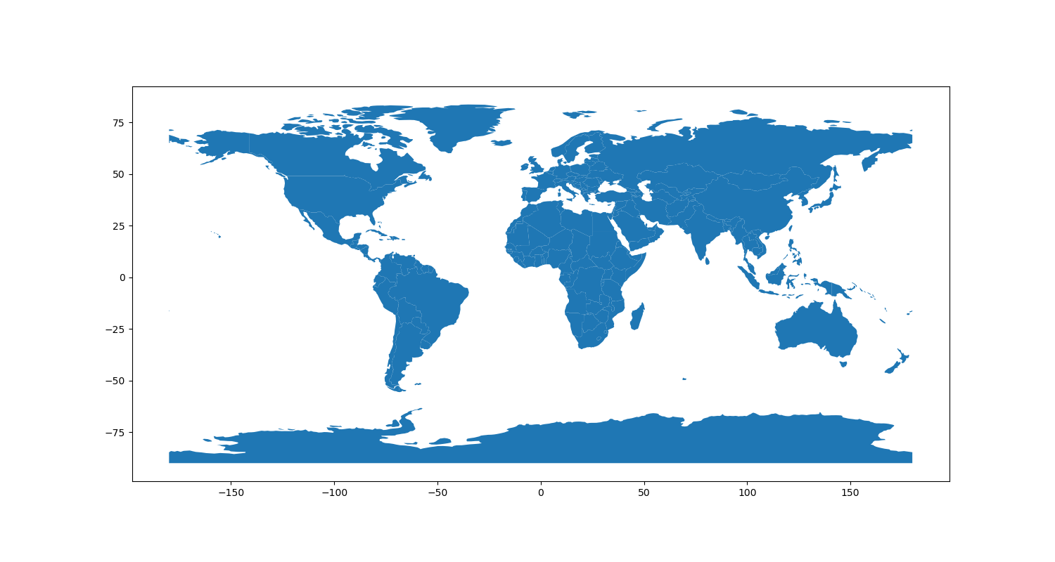
Because head() worked, we know that we have successfully loaded our dataset into a GeoDataFrame!! We can now plot it onto a map using pyplot with just a few more lines of code:
Firstly, add this
importstatement immediately after the existinggeopandasimportstatement:
from matplotlib.pyplot import subplots, savefig
This will import two more functions into our code (subplots and savefig ) from the matplotlib.pyplot library. This is the library that deals with drawing maps for us.
Now, add the following snippet to the end of your code and run it:
# create map axis object
my_fig, my_ax = subplots(1, 1, figsize=(16, 10))

# plot the countries onto ax
world.plot(ax = my_ax)

# save the result
savefig('./out/1.png')
print("done!")
This section uses the subplots() function that we imported from the matplotlib.pyplot library in order to create a figure (the ‘canvas’ onto which the map is drawn) and an axis (the map itself), which we will store in the variables my_fig and my_ax respectively.
The terminology relates to the fact that pyplot is used for all kinds of scientific drawing, not just maps. In essence, the figure, is the actual ‘picture’ that you end up with, which can be made up of one or more axes - as you can see in the below illustration from Earth lab (I know that this is a little confusing, but you will get the hang of it in no time!):
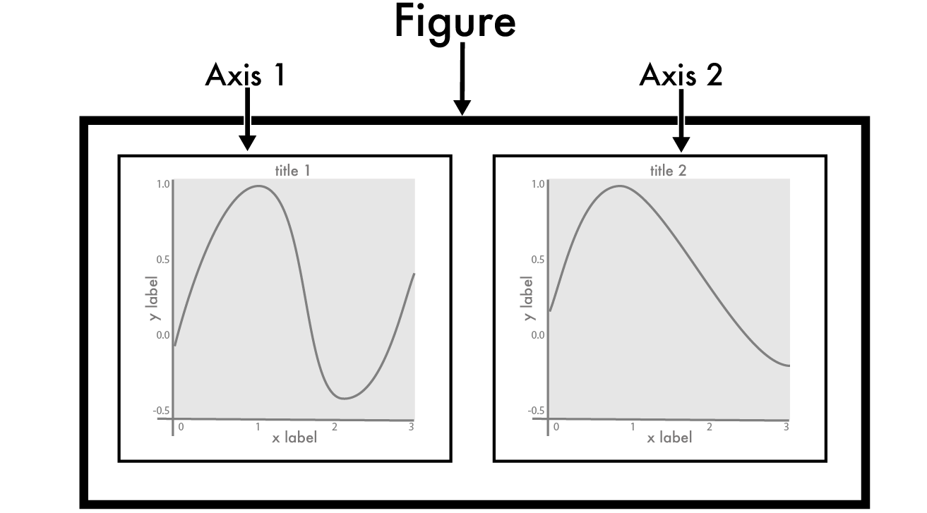
Now we have an axis object (my_ax), we draw the data to it with world.plot(ax = my_ax). Here we are using the .plot() function of the GeoDataFrame object in our world variable to draw the map. Crucially, by setting the ax argument to our my_ax variable - we make it draw onto the axis my_ax, which is contained within our figure (my_fig).
Finally, we save the figure with the savefig() function that we imported from matplotlib.pyplot. If all went to plan, you should have a new file in your week1/out directory called 1.png that looks like this:
You can view this in Spyder by selecting the Plots tab in the in upper-right panel, or simply by looking at it in Explorer (Windows) or Finder (Mac).
Have a careful read over that section again - does it make sense? If not, ask!
Removing the axes
It is a bit confusing that pyplot uses the term axis both for the individual map on the figure, as well as for the x and y axis on the sides of the map (the numbers across the left and bottom). Given that these numbers are pretty useless in the context of a global map, we are going to turn them off, which requires us to use the .axis() function of our axis object (that is stored in the ax variable):
I told you it was confusing…
Add the following line to your code - it needs to be after the variable
my_axis created (otherwise the Python interpreter won’t know whatmy_axis) but before thesavefig()function is called (otherwise it will be too late as the image has already been saved to disk!)
# turn off the visible axes on the map
my_ax.axis('off')
Run your code again, if it went to plan, you should have something like this:

Much better…!
Adding some more data
Now we have a basic map, let’s add some more data to it:
Add the following
read_file()statements immediately after the other one:
graticule = read_file("../data/natural-earth/ne_110m_graticules_15.shp")
bbox = read_file("../data/natural-earth/ne_110m_wgs84_bounding_box.shp")
This load datasets containing a graticule (grid) and a background (representing the sea) into GeoDataFrame objects, enabling us to:
Replace the
world.plot()statement with the the following threeplot()statements and run the code:
# add bounding box and graticule layers
bbox.plot(
    ax = my_ax,
    color = 'lightgray',
    linewidth = 0,
    )

# plot the countries
world.plot(
    ax = my_ax,
    color = 'black',
    linewidth = 0.5,
    )

# plot the graticule
graticule.plot(
    ax = my_ax,
    color = 'white',
    linewidth = 0.5,
    )
If all went to plan, you should now have something like this:
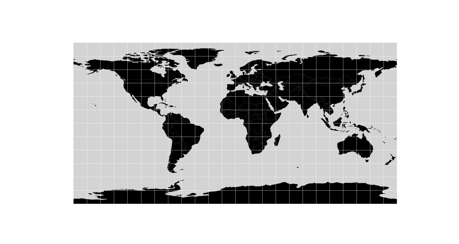
Better still, right?
Now change the colours around until you are sure that you have got the hang of how it works
Styling using data
Now we have a map, we can use it to show us something about our dataset.
Note that not all of the columns are shown in the sample that you get back from the print(world.head()) statement, as the data would be too wide to fit in the console window.
To see a complete list, add the below line to your file immediately after the world variable is populated, and then re-run your code:
print(world.columns)
If all has gone to plan, you should have something like this in your console:
Index(['featurecla', 'scalerank', 'LABELRANK', 'SOVEREIGNT', 'SOV_A3',
       'ADM0_DIF', 'LEVEL', 'TYPE', 'ADMIN', 'ADM0_A3', 'GEOU_DIF', 'GEOUNIT',
       'GU_A3', 'SU_DIF', 'SUBUNIT', 'SU_A3', 'BRK_DIFF', 'NAME', 'NAME_LONG',
       'BRK_A3', 'BRK_NAME', 'BRK_GROUP', 'ABBREV', 'POSTAL', 'FORMAL_EN',
       'FORMAL_FR', 'NAME_CIAWF', 'NOTE_ADM0', 'NOTE_BRK', 'NAME_SORT',
       'NAME_ALT', 'MAPCOLOR7', 'MAPCOLOR8', 'MAPCOLOR9', 'MAPCOLOR13',
       'POP_EST', 'POP_RANK', 'GDP_MD_EST', 'POP_YEAR', 'LASTCENSUS',
       'GDP_YEAR', 'ECONOMY', 'INCOME_GRP', 'WIKIPEDIA', 'FIPS_10_', 'ISO_A2',
       'ISO_A3', 'ISO_A3_EH', 'ISO_N3', 'UN_A3', 'WB_A2', 'WB_A3', 'WOE_ID',
       'WOE_ID_EH', 'WOE_NOTE', 'ADM0_A3_IS', 'ADM0_A3_US', 'ADM0_A3_UN',
       'ADM0_A3_WB', 'CONTINENT', 'REGION_UN', 'SUBREGION', 'REGION_WB',
       'NAME_LEN', 'LONG_LEN', 'ABBREV_LEN', 'TINY', 'HOMEPART', 'MIN_ZOOM',
       'MIN_LABEL', 'MAX_LABEL', 'NE_ID', 'WIKIDATAID', 'NAME_AR', 'NAME_BN',
       'NAME_DE', 'NAME_EN', 'NAME_ES', 'NAME_FR', 'NAME_EL', 'NAME_HI',
       'NAME_HU', 'NAME_ID', 'NAME_IT', 'NAME_JA', 'NAME_KO', 'NAME_NL',
       'NAME_PL', 'NAME_PT', 'NAME_RU', 'NAME_SV', 'NAME_TR', 'NAME_VI',
       'NAME_ZH', 'geometry'],
      dtype='object')
There is quite a bit of data there, here is an interesting selection:
| Column | Description |
|---|---|
POP_EST |
The estimated populaton of the country |
CONTINENT |
The continent that the country includes the country |
NAME |
The name of the country |
ISO_A3 |
An unique 3 letter code for each country (e.g., GBR for the United Kingdom) |
GDP_MD_EST |
The estimated Gross Domestic Product (GDP) for the country |
geometry |
The geometry (shape) of the countries |
For example, let’s colour each country according to the estimated population:
Replace the
world.plot()statement with the below snippet and run the code
# plot the countries
world.plot(								# plot the world dataset
    ax = my_ax,						# specify the axis object to draw it to
    column = 'POP_EST',		# specify the column used to style the dataset
    cmap = 'OrRd',				# specify the colour map used to style the dataset based on POP_EST
    scheme = 'quantiles',	# specify how the colour map will be mapped to the values in POP_EST
    linewidth = 0.5,			# specify the line width for the country outlines
    edgecolor = 'gray',		# specify the line colour for the country outlines
    )
You should now have something like this, where darker colours represent greater population:
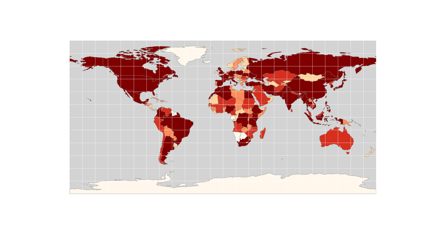 Let’s just have another quick look at that snippet - you should be able to work out from the names what each argument in the
 plot() function is doing there, but a few key parts are:
column = 'POP_EST' - this is the name of the data column with which we want to colour the map
cmap = 'OrRd' - this is the name of the colour ramp that we want to use top colour the map. There are many options available (below are just the sequential patterns):

scheme = 'quantiles' - this is the name of the classification scheme (how the data values are classified to the various colours). Quantiles is an ‘equal count’ classifier, where the data are divided into a number of classes (default 5), each with the same number of data points. It is well suited to linearly distributed contiuous datasets, but you must be aware that similar features can be placed in adjacent classes, which can be misleading (more classes reduce this effect).
There are lots of options here too, listed on the mapclassify website, though not much information is given, so you will need to look them up and/or use trial and error to explore them!
Setting the CRS and Calculating New Columns
On the face of it, this looks great, until you realise that in most cases, the colour really just relates to the size of the country (with the odd exception). It is far more interesting to look at population density, which is the population divided by the area of each country. In order to achieve this, we simply need to create a new column in our dataset that is equal to the number of people per km2.
However, before we do that, we need to set the Coordinate Reference System (CRS) of the map. The map is currently being drawn without any defined CRS, resulting in what we call an “accidental equirectangular” or plate careé projection. However, as we heard in the lecture, if we want to do a calculation based on area, we need an Equal Area projection. The big question is… which one…?
Understanding CRS’ in detail is important for a GIS expert, but this is not the purpose of this module. For this reason, we will often turn to a useful online tool called the Projection Wizard. The tool is described in detail in Šavrič et al (2017) and is based on a range of studies into the selection of map projections, including: Jenny et al (2017)., Šavrič et al., 2015. and Snyder, 1987.
Basically, all you have to do is tell the wizard which region you want to map (either by typing the coordinates in or dragging the box on the map), and what kind of projection you want (equal area, conformal, equidistant, compromise) - it will then make one or more suggestions for which you should use:
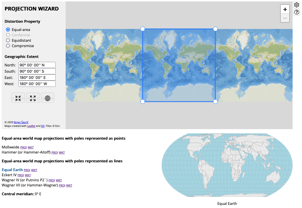
Go to the Projection Wizard, it should already be set up for an Equal Area World Map.
Have a play with it to get a feel for how it works, then set it back to Equal Area and a world map centreed on the Greenwich Prime Meridian
Click on each of the six suggestions to compare them and select one.
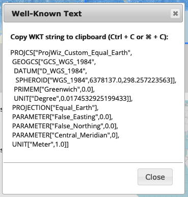
There are two ways to represent a CRS to pass to software, and both are examples of strings:
- Proj string: this is the original format used by the Proj software library, which is used to handle CRS’ for almost all geographical software. However, due to changes in the Proj library in recent years, this format is (in some cases) a little less precise. The trade-off is that it is easier to read, write and understand.
- WKT string: this means Well Known Text and is a newer, more flexible and (in some cases) more precise representation. The downside is that they are very long and difficult to understand.
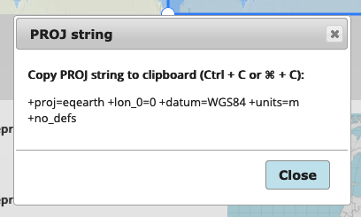
Have a look at both the Proj and WKT strings for your chosen CRS to compare them by clicking on the
ProjandWKTlinks next to your chosen CRS.
This should bring up a box like this (my selection is the Equal Earth Projection) - you can see the difference in complexity!
Before we go any further - note that the extent of your CRS has to align with the extent of your dataset, otherwise some of your data will ‘fall off the end of the end of the world’, which causes unpredictable errors in drawing the map. This is sometimes referred to as the antimeridian wrapping problem. Our dataset is centered on the Greenwich Prime Meridian (0 degrees East/West) so, because we are dealing with a global dataset, we need to make sure that our CRS is as well. In a Proj string, this is shown by the parameter +lon_0=0. In a WKT string, this is shown by the parameter PARAMETER["Central_Meridian",0]. In either case, you can simply return the Wizard to this position by pressing the Select Entire World button:

Check that your CRS matches the dataset using the above explanation to make sure that your CRS is centered on 0 degrees East/West.
In time, it is likely that WKT representation is the only one that is used. For now, we can use either, and we will use both during the course. For simplicity, we will use the Proj string on this occasion.
Copy the Proj string for your chosen CRS, and store the result as a string in a variable called
ea_proj-remember to use speech marks (" ") to define the string!!
Add the following snippet to transform your three datasets into the Equal Area projection (think carefully about where they should go - see the note below the snippet if you aren’t sure).
# reproject all three layers to equal earth
world = world.to_crs(ea_proj)
graticule = graticule.to_crs(ea_proj)
bbox = bbox.to_crs(ea_proj)
Note: These statements will need to be after the read_file() statements (otherwise the Python Interpreter won’t know what the world, graticule and bbox variables are), and also after the definition of the Proj string (otherwise it won’t know what the ea_proj variable is). However, it must be before you try to plot any of the datasets using a .plot() function (as otherwise you will apply the projection after it has already drawn the map, meaning it will have no effect!).
Now, we can use GeoPandas to create a new column in our GeoDataFrame called pop_density, which we can create simply by specifying the name: world['pop_density']. We then use the values from the existing POP_EST column (world['POP_EST']) and the area property of the GeoDataFrame object (world.area). We divide the area by 1000000 to convert the value from people per m2 to people per km2.
Add the following snippet after the projection statements then add a
print(world.columns)statement immediately afterwards - has your new column appeared?
world['pop_density'] = world['POP_EST'] / (world.area / 1000000)
Note how geopandas allows you to simply use data columns as if they are numbers - this makes our life very easy compared to having to work our way through all of the values in each column manually!
Update the
columnargument of theworld.plot()function topop_densityand Run the code.
If all went to plan, you should have something like this (remember that it will only look exactly the same if you picked the same CRS as me - Equal Earth - it doesn’t matter which you pick as long as the output matches the demo on the Projection Wizard):
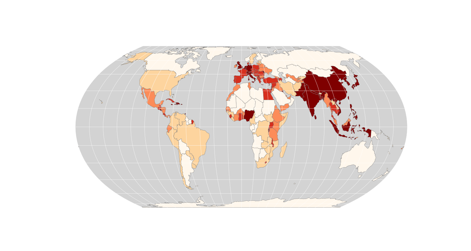
Now our map uses the Equal Area Projection, and displays population density, which is a little more meaningful than population alone. We just need a few final tweaks to finish off our map.
Add the following snippet to your code
Replace
<INSERT CRS NAME HERE>with the name of your chosen CRS
my_ax.set(title="Population Density: <INSERT PROJECTION NAME HERE> Coordinate Reference System")
Note: This statement uses the my_ax variable, so it must be placed after this variable has been created, but before the imaged is rendered (as otherwise it will be too late to change it!):
Add the following extra arguments to the
world.plot()function in order to add a legend to the map:
legend = 'True',
legend_kwds = {
    'loc': 'lower left',
    'title': 'Population Density'
    }
Run the code
If all has gone to plan, you should have something like the below:
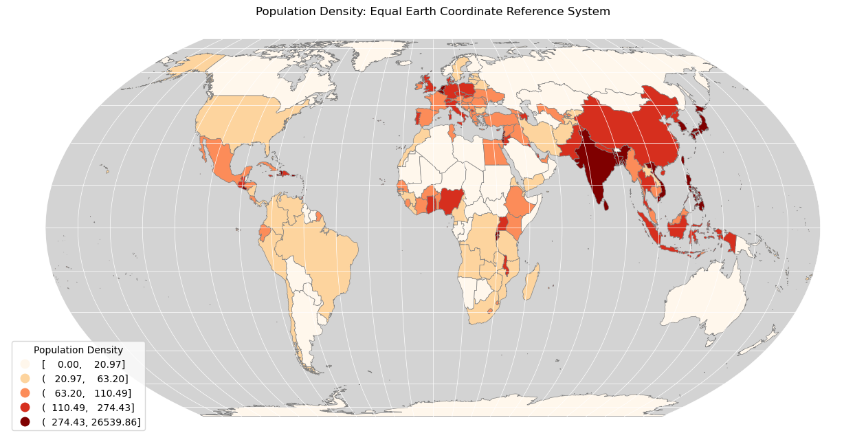
If so, then CONGRATULATIONS!! You have made your first map using GIS!!
Conclusion
Whilst it initially seems like a lot - I hope that this is starting to make sense. It may seem like overkill to write a program to create a simple map such as this, but it means that you have a tremendous amount of control over the maps that you produce as your outputs become increasingly complex (much of what we do in this course isn’t even possible in a desktop GIS!).
We’ve covered a lot of ground today, so please don’t worry if you don’t feel that you understand it all fully, I promise that you will soon! The thing to focus upon is that you have made your first map using nothing but Python, and that’s pretty good going for week one!
See you next week!
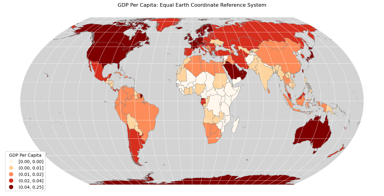
A little bit more…?
Each week I will give you a bit of an ‘extra’ challenge that you can address during the week to polish your skill and reinforce your understanding. Here is the one for this week:
Produce a map for GDP Per Capita - an estimate of GDP is given in the column
GDP_MD_EST
Per Capita means per person, so to work this out all you need is the GDP and the population, both of which are already in the dataset!
If you get it right - it should look something like this (comparing the two maps tells us a lot about patterns in the distribution of wealth and people across the world…):